Voog, pronounced ‘vogue’ is a clean and simple website builder that hails from Tartu, Estonia. It was founded in 2008 by CEO Tõnu Runnel and developer Priit Haamer. Originally called Edicy, it was rebranded in 2014 and has one particular advantage over other website builders. It’s geared to make creating a multilingual websites a pleasure, rather than a pain.
But even small business owners that don’t need a multilingual website will appreciate the simplicity of this website builder. By stripping its offering down to the bare essentials, you can get on with runningyour website, instead of spending hours getting it up and running. This is how it compares to the competition.
User experience
If you can click, drag & hold, you can build a website with Voog. The editor interface that sits across the bottom of your screen gives you only a few options. For more experienced users this might not be enough. But inexperienced website builders will find it much less confusing to work with. You can add other elements to your page by clicking on the small buttons embedded in the website.
There’s only one small criticism. You cannot customize the layout of your pages. It offers either a homepage layout, which consist of two columns, or a common page layout which simply stacks elements on top of each other. This isn’t very flexible, but if you can work within these restrictions, you can still make a beautiful website.

Adding images is also awkward. First, you need to add a text element to your page. Then upload your image under the files tab and finally drag the image into the text box. It could be made much simpler. However, the files tab holds your images, which makes it easier to add the same image on multiple places. Deleting images is a simple matter of dragging the element and dropping it onto the rubbish bin icon that pops up.
Everything feels very intuitive and even if you’ve never used a website builder before it won’t take you long to find your way around the editor.
Blogging
Voog offers a versatile blog option for those who wish to add one to their site. Unlike so many other website builders, you can create drafts and set publish dates for each post you create. And readers can add comments although there is no option for integrating it with Disqus or Facebook.
Voog makes blogging as easy as creating a Microsoft Word document. You simply fill out the title & body and add images or video to your post by dropping them into the text exactly where you want them.
Themes
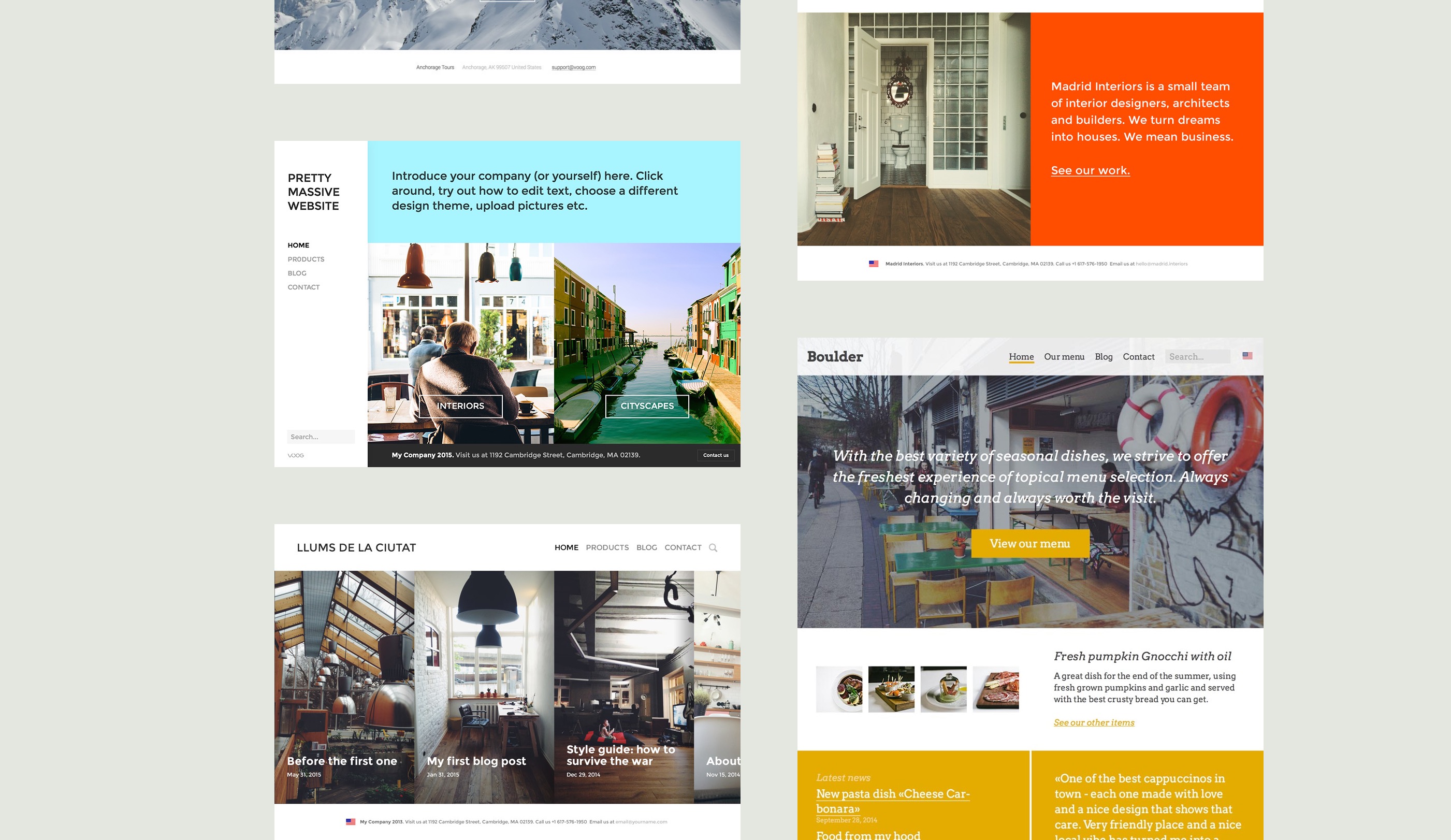
Unlike most website builders, Voog only offers a total of 13 templates. That doesn’t compare well to the thousands offered by other website builders. But once again, it may actually make the design process much easier for beginners. You could spend hours browsing through hundreds of templates, unable to make a decision. With Voog, you have a limited choice so picking a theme for your website is much easier.
The themes they do offer are well-designed and have a modern, clean feel to them. No matter what business you’re creating your website for, you’ll find a suitable theme that you can easily customize with your own images.

Ecommerce
Voog doesn’t currently offer an option for selling your products online. But they are working on adding this important feature in the near future.
You could get around this problem in the meantime by making use of a third party platform to build your store and then copying and pasting the code into your Voog website. You’ll need to create a place for the third party code before you can drag and drop it. This could be confusing for new website builders, but those with a bit more experience should have no trouble getting it to work.
Multilingual
This is where Voog really shines. It offers one of the easiest multilingual integrations available. Although it doesn’t offer automatic translation, this is probably for the best. That often creates errors which users will pick up on right away. What it does do, is allow you to add a new language option. You’ll have to change the text and add the images to each page again, but since they’re already listed, it’s easier than rebuilding everything from scratch.
A flag in the top right-hand corner allows users to select their country, or you can set it to automatically select the language based on the user’s geographical location. For businesses that require this feature, Voog offers one of the simplest options for creating a multilingual website.
Newsletter and Form Builders
Voog doesn’t offer any kind of newsletter sign-up element, but you can create a variety of form fields. Some website builders don’t offer much flexibility in this department so that counts in Voog’s favor. You can customize the submit button text, set forms to submit to a custom URL and receive submissions at an email address. However, Voog doesn’t save these submissions in any kind of database so you’ll need to create your own.

In conclusion
Websites created with Voog are straightforward and stylish. It may not have all the bells and whistles of other website builders, but for small businesses it offers a quick and elegant solution. Uncluttered and easy to navigate, you’ll be able to create a working website in minutes. It’s particularly useful for companies that want to create a multilingual website without wasting time. Voog was spotted on AngelList, where they provide information about the startup, product and team.