If you’re looking to edit your mobile view in Elementor, there are a few things you’ll need to do.
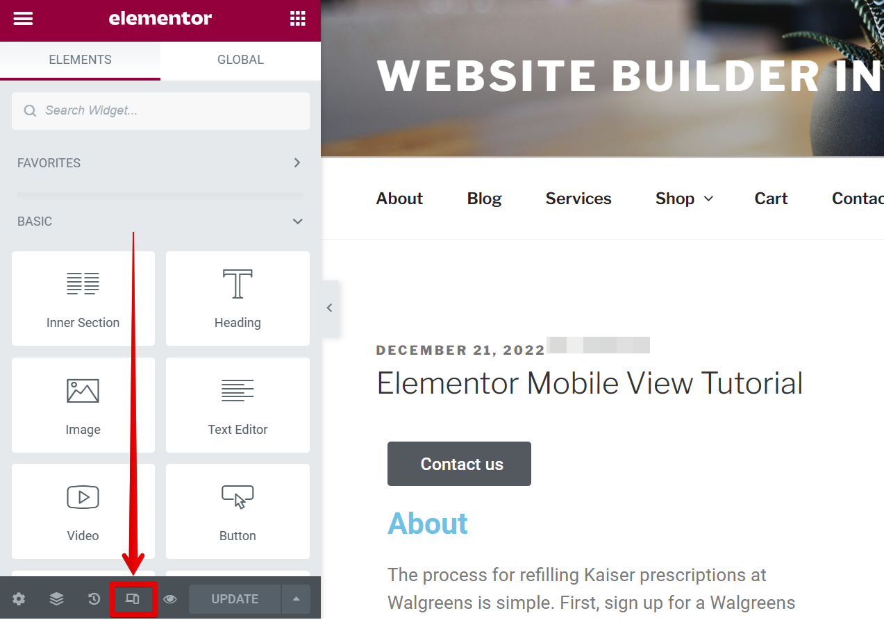
First, open your Elementor editor and navigate to the “Responsive mode” in the bottom menu.

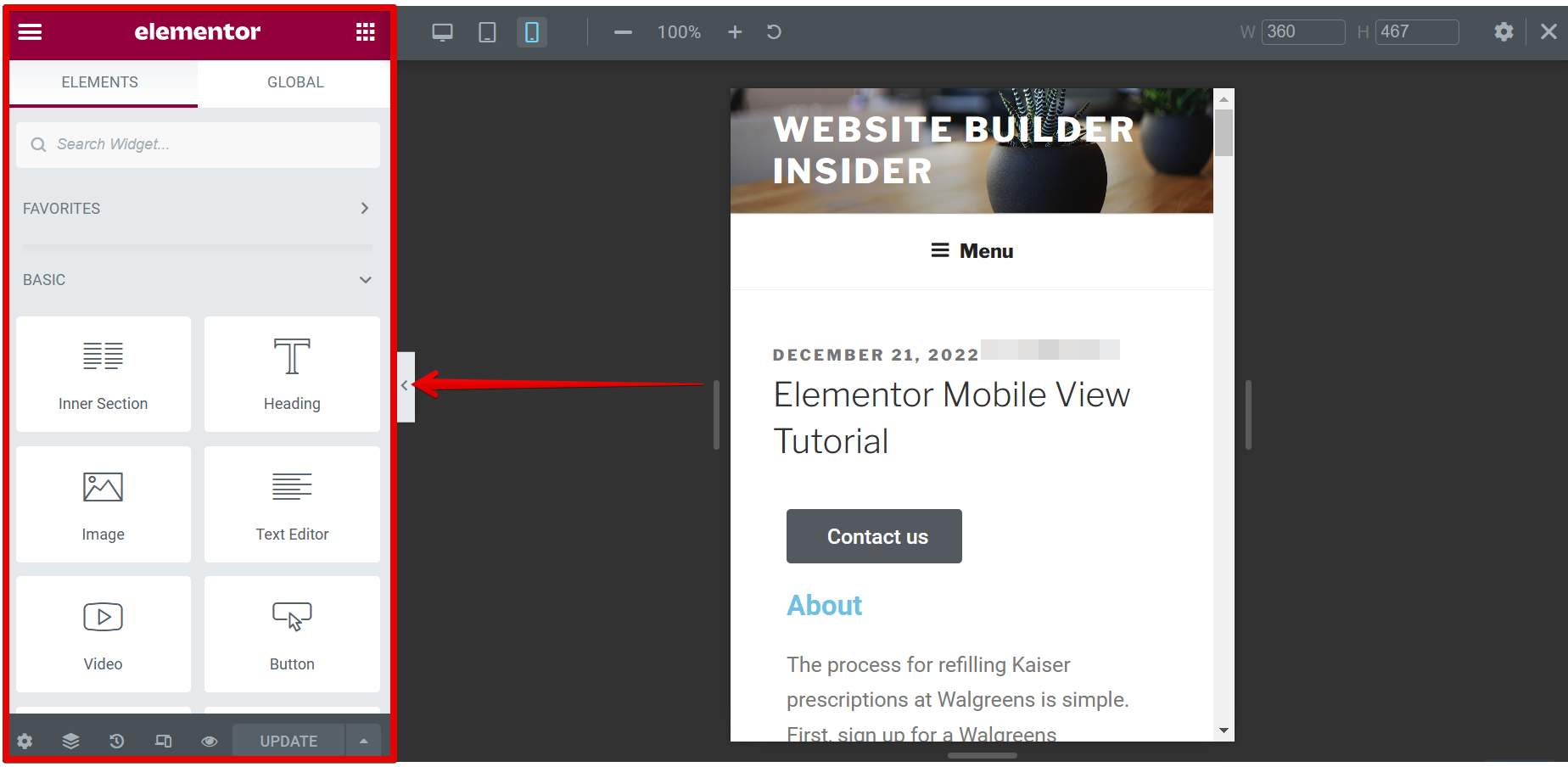
Once you click the “Responsive menu” button, you’ll find a “mobile” icon at the top of the page. Click on it to edit your mobile view.
![]()
Now that you’re in Mobile View, you can freely add Elementor elements here with the same available settings as Desktop View and Table View which is found on the left-hand side.

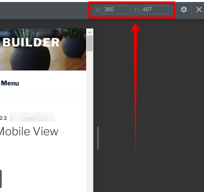
You can also change the size of the Mobile View using the section on the upper-right corner of the page where you can input the Width and Height dimensions.

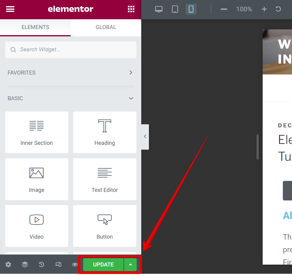
Once you’ve completed editing the mobile view of your website, just click on the “Update” button to save your changes, then go back to the Desktop View by clicking the desktop icon at the top of the page.

If you have any questions or suggestions about editing your mobile view in Elementor, please don’t hesitate to contact us.