When creating a website for a small business, non-profit organization or starting your blogging career, you’d want it to be visually appealing to a modern audience. There are many trends developing in the web design world which are geared toward creating interactive and eye-catching web pages. However, many of these trends leave as quickly as they come and actually lead to unhappy visitors.
Creating an effective and elegant website involves minimal clutter and user-friendly navigation. Let’s explore the world’s worst web design trends and discover the most important mistakes to avoid.
Annoying Pop Ups
Many sites are using aggressive pop ups as a ‘call to action’ feature. They usually come up as soon as you open the webpage or before you’re allowed to leave it. The purpose of these pop ups is to get you to sign up for a newsletter, discount code or free membership. Examples of websites that use this tactic include About.com, Prevention.com and CNBC.com.

Readers and customers find these call to actions to be invasive and annoying, especially on mobile devices. In a lot of cases, you have to search for the exit button for these pop ups when on a smart phone. They block out the majority of the content and make it feel like you are being bombarded with sales pitches.
If you actually give in and sign up, many websites continue to bombard your inbox with unwanted emails. For these reasons, aggressive pop ups lower conversion rates and have the potential to damage a brand.
Hard to Read Captchas
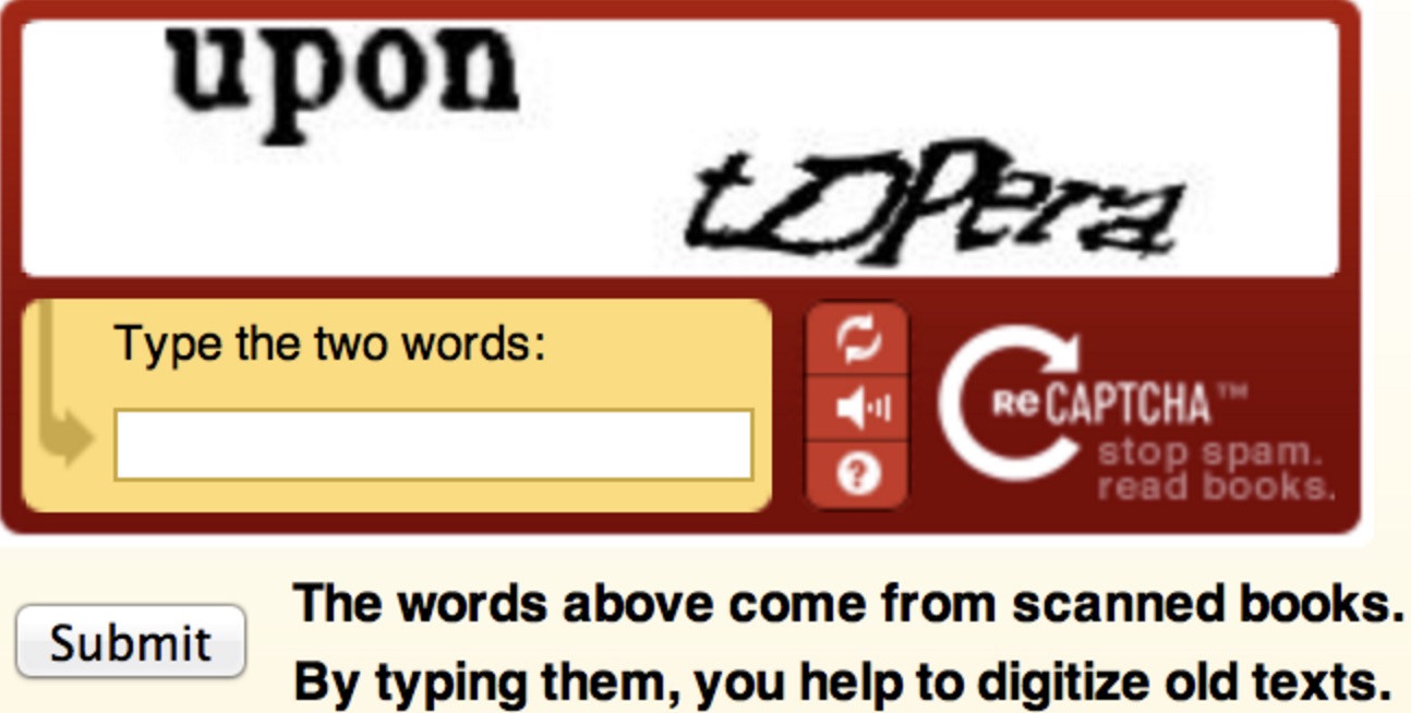
Keeping non-human entities from accessing information on your website (or spamming your contact page) is definitely a worthy endeavor. However, it’s important to make sure that the Captcha widget is easy to read and use. If your Captcha is too fuzzy or blurry, it will prevent real visitors from accessing your site.

Preloading Pages
We’ve all experienced the frustration associated with preloaders. You see something that interests you and click on it only to be faced with a tiny spinning circle or acrobatic dots. You’re left with two choices: to sit and wait for the page to load or close it and find something new to read. By the time the page has loaded, many readers lose interest in the material.
Websites with complex material such as videos, images and graphic effects use this web design option to display all of the page at once. Unfortunately, long wait times are not good for search engines visibility, lower conversion rates and frustrated visitors.
Background Music
Engaging multiple senses of the viewer feels like a good idea to some web developers and they may add background music to the webpage. While this may help create atmosphere and connection, it can also decrease download speeds and interfere with music already being played by the viewer. Another drawback is that many Internet users keep their sound on mute, making sounds an ineffective way to connect with visitors. The few exceptions to this would be websites for musicians, instrument sales or radio stations.
See our top pick example, which works well for the above and below mistakes as well.
All Flash Sites
It’s true that animated graphics improve the look of your website and attract attention. Unfortunately, it’s also true that they are not compatible with a number of mobile devices, especially devices made by Apple. The good news is that there’s new technology in the form of HTML5 and CSS3 which allow web developers to integrate graphics without using proprietary software. HTML5, CSS3 and JavaScript are capable of doing many of the same things as Flash without the compatibility complications.

Endless Scrolling
Many bloggers and content websites use this feature because it improves readability. This is usually beneficial for mobile readers because it reduces the amount of effort put into touching tiny links to move to the next page.
The downside is that if your website has important links in the footers, visitors will never be able to access them. If your footers feature contact, login or FAQ information, this can be especially problematic. Examples of websites that implement infinite scrolling include HelloMonday.com, Behance.com and ReformRevolution.com
The Hamburger Menu
The hamburger menu is the mobile menu that looks like three horizontal lines in the top left or right corner of the page display. Tapping these lines gives you access to the navigation links for the website. This type of menu makes perfect sense for smart phones and tablets with limited screen space.
However, normal desktop sites are now using the hamburger menu feature. The main issue with this is that it hides important information from visitors. Instead of seeing contact information or business hours directly on the home page, viewers must search for that information. This decreases visitor engagement and makes it harder for users to find other areas of your website.

Sticky Headers with Cookie Warnings
The purpose of a sticky header is to make the menu visible as you scroll with the website. This is great for navigation, especially on tablet devices. One issue to avoid with sticky headers is adding a cookie warning. These large warnings usually hide a large chunk of content which is not good for smart phones and tablets with limited screen space.
Bad Stock Photos
The biggest reason that many web developers use low-quality stock photos is because the high-quality options can be incredibly expensive. This results in awkward, unrealistic or lifeless photos on a lot of websites. These often turn customers away because they look cheesy and unprofessional. Another thing to consider is that a lot of scam companies use low-quality stock photos, and you definitely want to avoid giving the impression that you’re just another Internet con artist.
Conclusion
The main ideas you want to keep in mind when designing a web page are to make important information visible and easily accessible, design a plausible layout, don’t add extra frills and create a responsive format. If you want to reference other articles or calls to action, create hyperlinks within the text body instead of using aggressive pop ups in the middle of a page.
Avoid using features that distract the customer, reduce load times or interrupt the reading flow. Overall, your website should be user-friendly, attractive and informative.